Mindset Mobile App Revamp
A mobile app dedicated to delivering exclusive, intimate audio and video collections of personal stories and life lessons shared by a diverse group of artists.
A project for DIVE Studios
Role: Product Designer
Responsibilities: UX/UI design, user research, wireframing, prototyping, usability testing
Project team: CEO, VP of Growth, VP of Product, Engineers, and Marketing Manager
Timeline: 6 months
Background
Mindset was launched as an audio platform in August 2021. The platform was developed with the goal of normalizing vulnerable conversations around life and the human experience. It has grown tremendously, transitioning from fan-based listeners to everyday users who seek understanding, inspiration, and connection through storytelling in the most organic way.
Just as Mindset's users desire more than simply listening to audio collections from artists, we wanted to enhance their user experience by redesigning critical features, improving interactions, and offering more content that is relevant to our existing product.
Problems
From qualitative and quantitative feedback, we knew this platform was in need of a revamp in order to retain and expand our user base and improve our productivity.

User insights
We conducted interviews with our users to identify their pain points and uncover additional insights and areas of opportunity for improvement.


Competitive analysis
We performed a competitive analysis on other audio/video platforms to identify their strengths, weaknesses, and existing solutions. Additionally, we closely examined their strategies related to content organization, onboarding processes, user journeys, and pricing models.
To our surprise, none of our competitors offer a feature that enables users to share their experiences through curated clips and images of their favorite artists on social media. With no viable solutions currently available, Mindset stands to seize a significant opportunity to enhance our product's user experience and strengthen our competitive edge

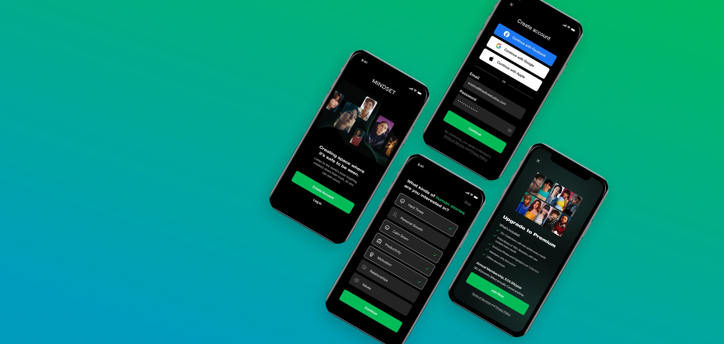
How we get there
With the collected data, we conducted a brainstorming session within the teams to evaluate and define a new approach to addressing the problems. It became evident that we needed to revamp the mobile app, devise an improved pricing solution, and continue collecting and analyzing data to provide a more thoughtful experience. This would result in users experiencing a better pricing model with access to all Mindset content, a redesigned homepage, a redesigned artist collection page, and a new booster page with a proper design system.

Every detail matters
One of the biggest challenges we faced at the time was the inconsistency in the design systems. There were no proper guidelines or documentation due to the lack of experience from the work of a design agency. The font choices were not suitable for mobile and web use, and there were too many colors in the color palette that did not align with the brand. The spacing between elements was inconsistent, making it challenging for engineers to implement.
While I was redesigning some critical features on the app, I took the opportunity to collaborate with a Marketing Manager and a VP of Product on the redesign of the design systems. Our main objective was to establish consistency and efficiency in creating user interfaces across various platforms. We took the responsibility of setting clear guidelines and creating comprehensive documentation to ensure that developers had a clear understanding of how to use components within the design system. Our efforts aimed to streamline the design and development process and promote a cohesive user experience throughout Mindset's products.


Why redesign the payment model
The primary reason for our low retention rate was the ineffectiveness of the a-la-carte payment model. According to our users, the price of $24.99 for a single audio collection was deemed too expensive. We started to see a drop in our revenue as well as conversion rate due to the lack of interest in artists who were not K-pop. Users were hesitant to purchase another collection from artists they might not be fans of or that didn't align with their interests. This reluctance prevented our users from purchasing new releases, leading to increased user acquisition costs and fostering pickiness, which is not sustainable for future product models.

New approach
User goal
We want to empower users to quickly evaluate and decide to purchase, knowing what they can get with the the subscription membership.
Business goal
We want to retain customers for the future product rather than needing to re-engage them on a more frequent basis. The primary metrics we would be looking at are ARR (annual recurring revenue) and churn rate.
Design principles

Final deliverables
After numerous iterations, I’m proud to unveil the final design. Developing this design involved close collaboration with the marketing team to create a better visual that highlights the diversity among our artists and showcases our improved annual membership pricing. Additionally, I worked closely with the VP of Growth to enhance the language and ensure greater clarity in our subscription messaging for users.

App Feedback
We use Discord platform to collect immediate user feedback on various aspects. Following the launch of Mindset's subscription model, these reviews were shared in our “app-feedback” channel.

Homepage redesign
Mindset's homepage serves as the backbone of our entire ecosystem. To support our expansion into a multi-product platform, a homepage redesign is necessary to deliver dynamic content to specific segments.
Problems:
Lack of critical content leading to decreased conversion rate
Low user engagement, with only 25% interacting with homepage content

New approach
User goal
By leveraging existing mental models, we can provide better user experiences in which they can focus on their tasks rather than learning new models.
Business goal
We aim to engage more prospects, generate more qualified leads, improve conversion rates, and increase awareness.
Design principle
Maintaining our homepage structure closely aligned with the previous one.
Suggested content should be personalized based on the user's selection.
The launch of the homepage should coincide with the introduction of the new subscription model.
Final deliverables
The new homepage enables users to explore more artists and their content. In addition to adapting vertical scrolling, we've implemented horizontal scrolling, providing cleaner transitions between sections and enhancing content visibility. The homepage is not too far off from the previous design, but we have eliminated unnecessary items for the very buggy header. Audio or video content is neatly categorized based on a certain topic such as Motivation. We removed the Daily Quotes Tab from the primary nav and changed it to Discover. Now that tab is dedicated to our Boosters content which drives the conversion rate.

App Feedback
These reviews were part of our mobile-app-feedback channel on Discord.

Artist collection page redesign
The artist collection is the most crucial feature of the Mindset app. Each collection showcases the entire audio/video collection from a famous artist. The content presented on the page should enable users to learn about the artist, discover topics of interest, view comments, listen and watch the content, share customized clips, and more.
Problems
A decrease in the conversion rate.
Limited scalability for future product models.

Key insights
Users are interested in having their favorite artists do a season 2 collection. Maybe a reaction to their previous mindset collection and explain how those topics are going for them if anything has changed, and they can add more topics to talk about.
The feature they want to see the most is video storytelling, and they do not mind reading subtitles because they want to hear the artist’s authentic voice.
Most of the users said they want to see vital information such as topics of interest and the latest episodes or boosters.
Nearly all users listened while multi-tasking, especially to enhance potentially boring activities (such as commuting or housework).
When asked if they engage in anything beyond listening, users said:
“I had shared with friends in 1-1 texts or conversations when certain collections came out.”
“Shared posts about upcoming mindsets on fb and twitter in the past.”
“Write down quotes from specific Mindsets that I find helpful on a sticky note.”
New approach
User goal
Users can access all premium content in one place more seamlessly and comfortably.
Business goal
We want users to assess their experience through free sample content and promptly make a premium product purchase to access all collection episodes, boosters, highlights, photo galleries, etc.
Design principle
Consolidate the new artist collection page to enhance the browsing experience.
Introduce a new layer of categorization within the existing structure.
Ensure existing collections and boosters remain easily accessible and unobscured.
Final deliverables
After many iterations, here is the mvp of the new artist collection page.
New Artist Collection page
Easily discover and listen to audio and video content
Engage with content more deeply by viewing and adding comments

Highlights tab
Users are able like and share curated clips straight from the app to others or post it on their social platforms.

Gallery tab
Users can also like and share photos from the collection to others or on social media such as Instagram.


New video experience
By leveraging our existing audio format to create the same experience for video, users do not need to learn anything new and are still familiar with the functionalities.
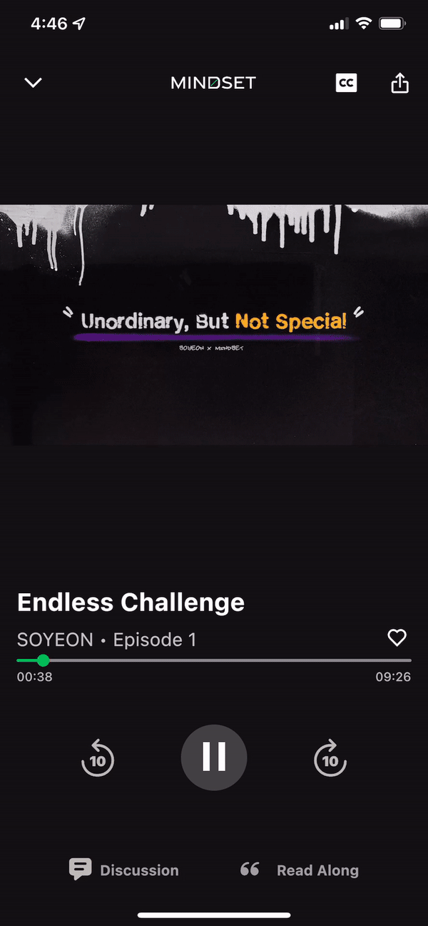

New audio experience
Due to the number of requests to feature more K-pop artists, we added the subtitle feature to our audio and video experience. We also changed other components to improve the overall experience.

Boosters page
Just as users want to fulfill their needs by listening to shorter content, we want them to experience the same flexibility and control when accessing our Boosters. The Discover Tab allows users to access Boosters content in seconds, so they can choose to listen to any topics they want.
Problems
Due to the content being free, it was hard for our team to track the conversion rate based on the user interaction with Boosters.

New approach
User goal
Accessing all Boosters in one place and listen to whatever they want.
Business goal
Increase conversion and retention rate.
Design principle
Put more emphasis on the feature.
Adding a new layer of categorization to the original structure.
Precise copy and clear visuals to help users understand the content quickly.
The content in each topic tab corresponds to the ones on the homepage
Final Deliverables
With the new design, Boosters have its own dedicated page and no longer just extra content. Users can easy access all of our Boosters under the Discover Page. They can view all Boosters from latest to oldest in one tab or view by topics.

App Feedback
These reviews were part of our mobile-app-feedback channel on Discord.

Impact
Since launching the Mobile App Revamp, our user engagement has grown substantially – helping to bring the Mindset App to more people.

This has resulted in an increase in average revenue, indicating that more users are subscribing to the app even though we removed the a-la-carte payment model. Despite the rapid growth, we were also testing out other new features such as Daily Check-in, while creating a web version of the Mindset App, which has not yet launched.
Reflection
During my journey at Mindset by Dive Studios, I've gained valuable insights into creating a meaningful impact despite the various challenges that came our way. I consider myself fortunate to have collaborated with such talented individuals. Together, we successfully revitalized the entire mobile app within a short timeframe, achieving the goals we had set for ourselves. While not all of our projects made it to launch, I'm proud that we were able to introduce the critical ones to our user base.
I extend my gratitude to our beloved users who consistently supported us through numerous user testing sessions and provided invaluable feedback that greatly influenced our product strategy. Their involvement has been instrumental in our journey of continuous improvement.